What is color theory?
Color theory is a set of rules that combines creativity and science. Color theory sets the fundamental guidelines around color combinations and harmony. Designers and artists rely on color theory to make the correct choices for their projects but they are not the only ones who use it. Most people unknowingly make everyday decisions based on color theory and color harmony. Understanding the guidelines of color theory can help you in so many areas of life, from your business to your clothes.
So whether you’ve come to the sudden realization your pants and shirt you’ve been wearing regularly for the past 3 years clash, and look hideous, and your wardrobe needs a serious revamp, or you are looking to design a high-end website or logo for your new business, this article may be of use to you.
Before we delve deep into the rainbow, and world of color and combinations, it’s important to understand that overuse of color can be detrimental to any design or style if used incorrectly or carelessly. This article will try to steer you in the right direction to minimize the chances of that happening.
In fact, minimal design is becoming increasingly popular in the online world of design, and using color theory is still as important as ever before in order to get it right. Incorporating minimal design, or minimalistic ux design into your website combined with the right understanding of color theory can result in you hitting the nail of the head and giving delightful experience to any visitor who happens upon your site.
We live in a highly visual world and it is impossible to master the art of visual communication without a good grasp of color theory. If you are a brand that wants to connect with your audience and followers then getting confident with the color spectrum is advisable. From understanding color colours all the way through to a deep understanding of colour wheel definitions is advisable.
Color Theory Definition
Colors are everywhere. In our daily lives, we are constantly surrounded by colors. These colors can influence our emotions – how we feel about someone or something – even how we think about brands. Marketers have been using the psychology of colors for decades and often draw on them to gain an emotional response from the customer.
In this post we will examine the different rules of color theory and break down some different color combinations and definitions, as well as the color mixing basics. There is also a section on specific color meaning and the power that color has on branding.
What are Color Palettes?
Color palettes can consist of a wide range of mixes. But there are some general rules they should follow for the best effect.
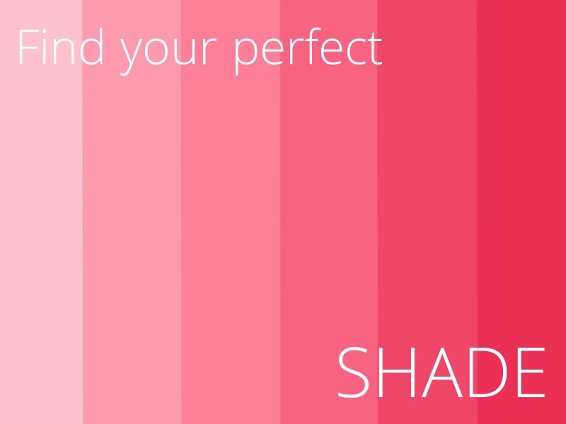
For the most part, using color schemes of different shades of one color is safest. Primary colors with different shades offer simplicity. All you need to do is add other imagery and mix the palette in a way that follows the principles of design.
When experimenting with other color relationships, some caution is required. Some combinations are just repulsive, such as bad news colors with colors with earthy tones. They contrast poorly and are naturally a pain in the viewer's eyes.
Our article on color harmony rules can help you a lot with this!
If you want to use secondary colors or additional colors, you definitely can (and normally should). In cases where you want to use a complicated color theme, you are best sticking with the same level of warmth. A color palette with different colors and a mix of cold and hot colors is hard to pull off and seldom works well. There are some examples where such mixes work, but it's safer to choose one of the following themes:
- Different shades of one primary or secondary color
- A mix of 4 or 5 different colors, but consistency in warmth or coldness
- Organizing each color in the palette in order of warmth, shade, and contrast
- Using similar color types throughout the palette
What are the 12 types of colors?
- Red
- Yellow
- Blue
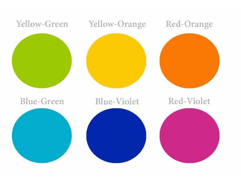
These are the basis of color theory and are then broken down as follows:
- Red-orange
- Orange
- Yellow-orange
- Yellow-green
- Green
- Blue-green
- Blue-violet
- Violet
- Red-violet
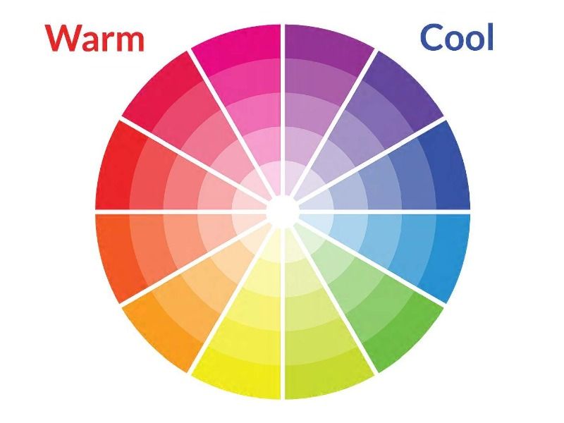
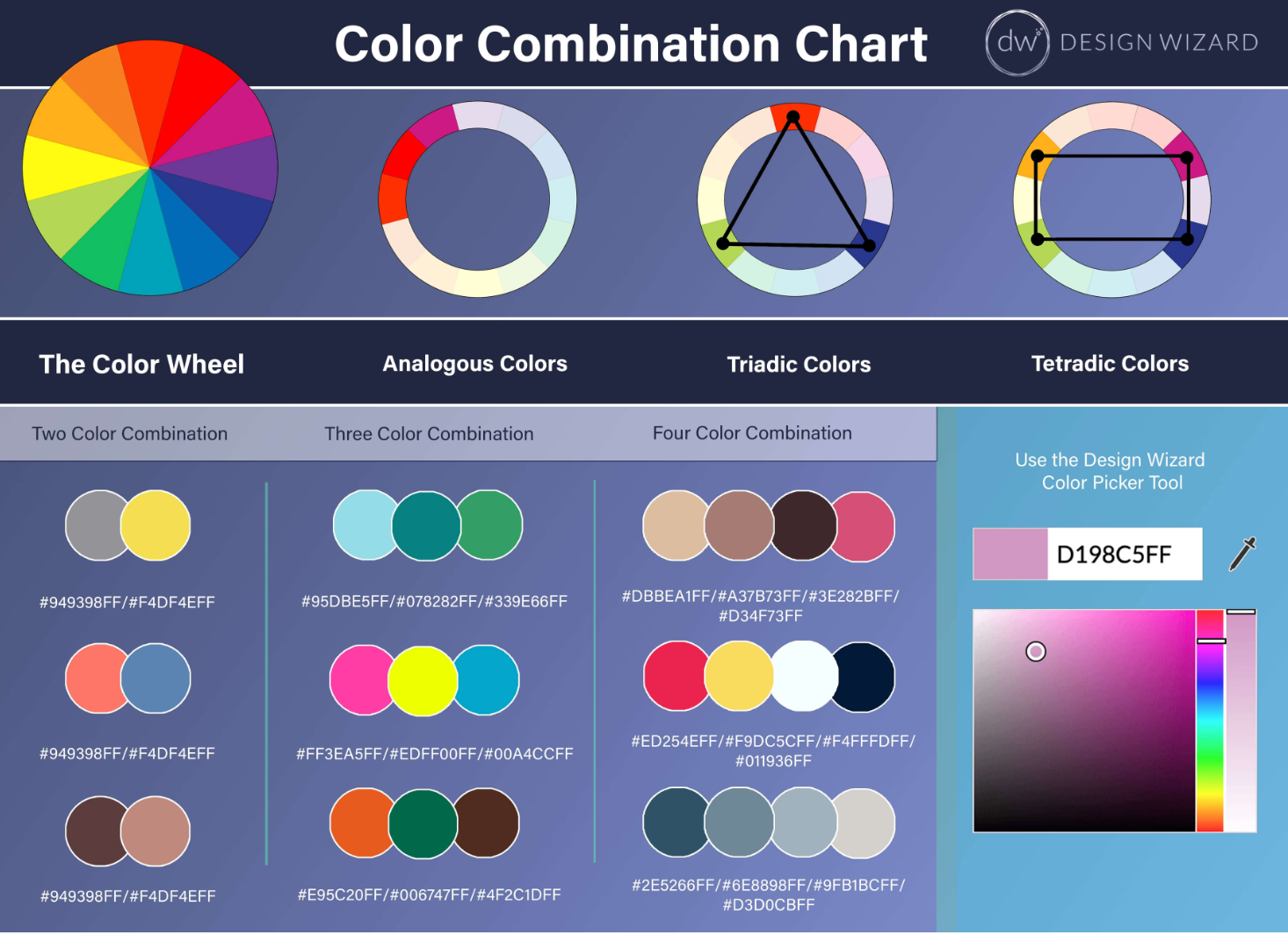
Refer to this color wheel and the general guidelines listed above when drafting your color palette.
What is a color wheel?
Step one to understanding color theory starts with the color wheel. In 1866, Isaac Newton used physics to develop a color disc based on how light reflected off prisms. His discoveries have laid the foundation for the color wheel as we know it today.
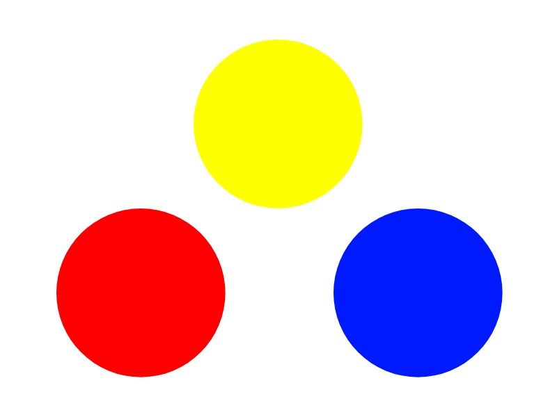
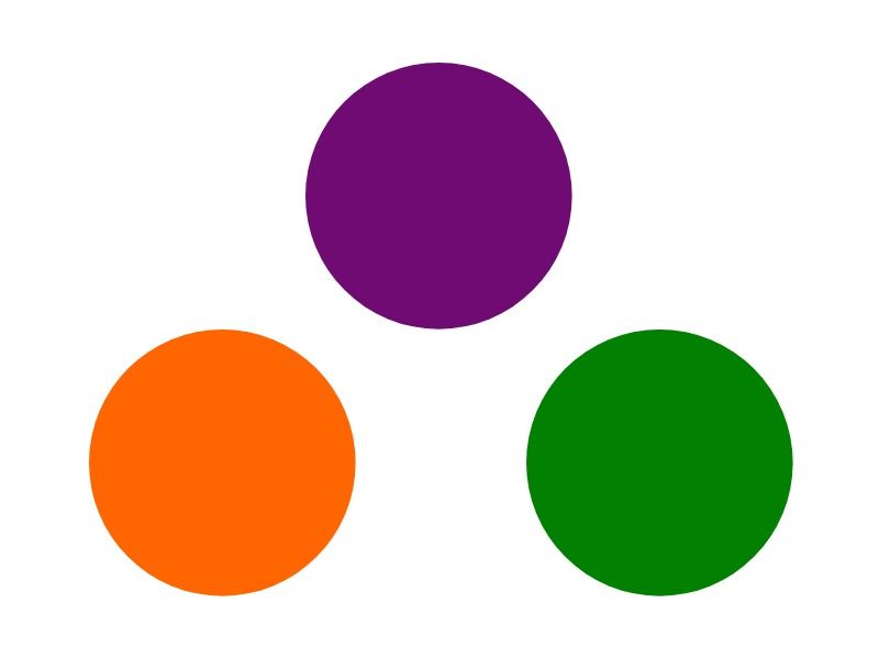
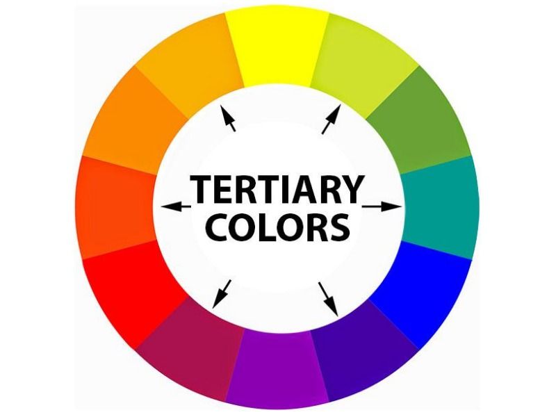
There are two models of colour wheel and the first is blue, red and yellow (RYB) which are universally known as the primary colors. Their corresponding secondary colors are then green, orange and purple. Tertiary colors are green-yellow, yellow-orange, orange-red, red-purple, purple/violet-blue and blue-green.
The second is RGB or red, green blue which is digital color. You could say there are two types of colour, subtractive and additive. Subtractive is physical colour, the most common type would be paint. Subtractive colour works by removing light, so if you kept adding purple paint to a canvas, it would eventually build to black.
Additive color is digital and adds light as you add more colour. Kee adding and it will eventually end up white.
Color harmony
Think of color harmony as the visual results from the rules of the color wheel. In order to understand the color theory definitions you need to know the importance of color placement on the color wheel.
These guidelines can be explained through 9 main color wheel rules: primary colors, secondary colors, tertiary colors, intermediate colors, complementary colors, monochromatic colors, analogous colors, triadic colors and tetradic colors.
In order to create true color harmony in your marketing collateral, your wardrobe and your interior design, it’s important to understand what colors work well together and why.
Primary Colors
Mentioned above there are simply three primary colors and they are red, yellow and blue. The purpose of primary colors is that they’re the basis all other colors may be derived. These three colors combined in all different sequins result in secondary colors. Without these three primary colors we would not be able to create any other beautiful colors.
Secondary Colors
As Colorwheelartist.com nicely describe secondary colors as the children of the three primaries that is simply what they are. Red, yellow and blue (the primary colors) combined result in orange, purple and green.
Tertiary Colors
Can you now guess how we make tertiary colors? Yes primary colors mixed with secondary colors. Again Colorwheelartist.com calls these colors the six grandchildren of the primary colors, therefor six tertiary colors are created in total.
Intermediate Colors
Intermediate colors are best described as opposite colors on the color wheel. These colors exist between each primary and secondary color on the color wheel. When naming the intermediate colors you always take the primary color name first.
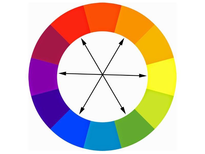
Complementary Colors
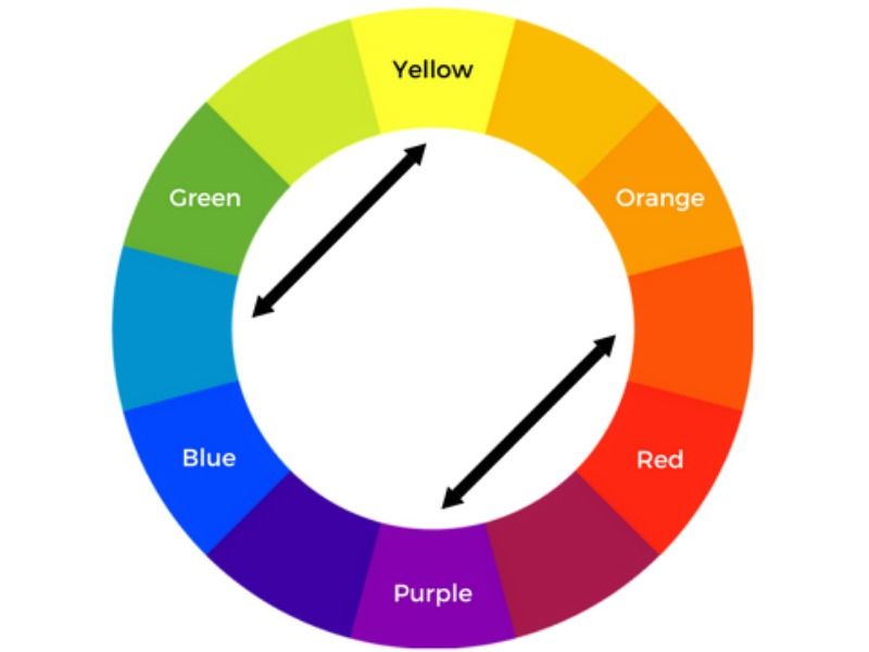
This is a method of combining colors that are opposite each other on the color wheel one side of the color wheel that consists of warm colors and the opposite side cool colors. Having one warm color and one cool colour is going to increase the contrast of these colors.
The aim is to achieve a vibrant harmonious color scheme by combining both. The important thing is to remember not to have those two colors at a high saturation as they will most definitely clash and be harsh on the eyes to look at. A good idea would be to pick one of the two colors to be your ‘main’ focus color and then the second color will compliment the main color.
Monochromatic Colors
What monochromatic colors are all the colors from a single hue using tints, shades and tones to lighten or darken the original hue. In more simple terms it may be an image of the clear sky and clear water below, the sky may be a pale blue color and the more defined areas a dark blue colour but all from the same hue.
Analogous Colors
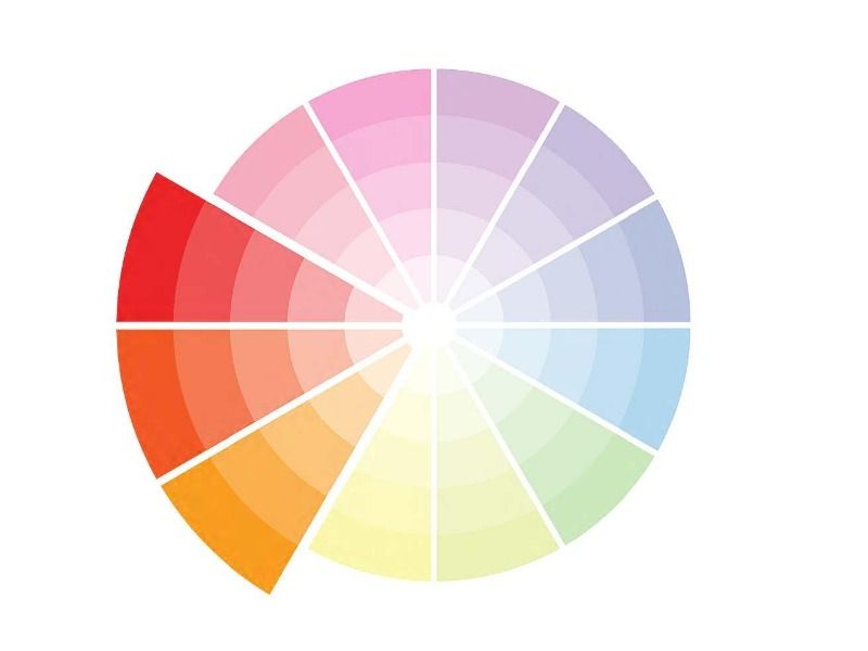
These are colors right next to each other on the color wheel so for example red, red orange and orange. Analogous is defined as things performing a similar function but having a different evolutionary origin. All three colors very similar but not the same carrying similar traits of each other. Analogous colors are evident almost everywhere and work so well to create a nice harmony in an image or in a real life setting like a sitting room.
For example when creating a design from scratch using analogous colors you wouldn’t have equal amounts of each color in the design typically you would choose just one ‘mother’ or some people may call it ‘dominant’ color and then use the rest to compliment it in your design. There are no specific rules but 3-4 colours worst best.
Triadic Colors
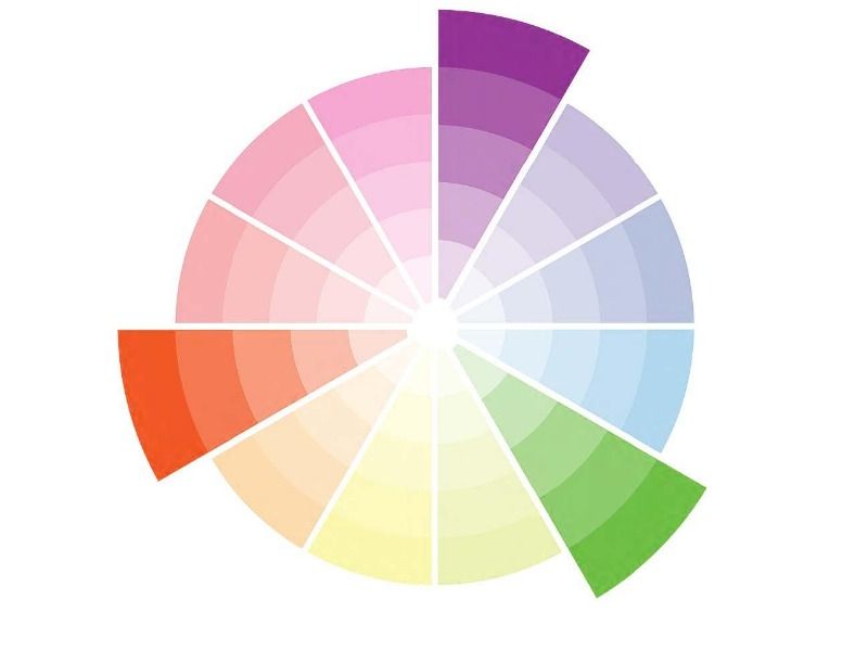
Triadic color schemes are three colors taken from the color wheel by forming a triangle connecting the three colors. Triadic color schemes always contain rich and vibrant colours of huge contrast you could say they’re the opposite to a monochromatic color scheme that we spoke about above.
For example, a triad could be made up of yellow, red and blue but if you think they wouldn’t compliment each other very nicely then you could take different hues, tints and shades from each colour and create a triadic color scheme from those.
Tetradic Colors
Similar to triadic colors a tetradic color scheme is combined of four colors that is made up of two sets of complementary colors. The four colors for a rectangular shape on the color wheel. On the short side of the rectangle there is only one colour separating the colors and on the long side of the rectangle there are three in between. Again like the triadic color scheme it is best to let one colour be the dominant or mother color.
Color Combinations
So, now that you know the basic rules around colour harmony, let’s delve a bit deeper into color combinations. Combining two, three, four and more colors together is definitely a skill in itself because the potential combinations are endless.
The most important thing to remember is balance, one colour should balance the next. If you are decorating a room, for example, it would be advisable to have one strong, or main colour and then the rest can work in harmony with that shade.
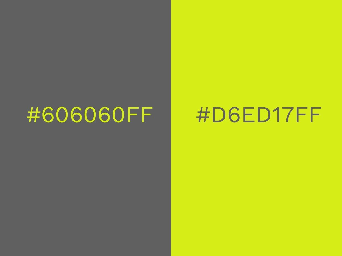
Take this interesting duo – lime green and grey. The zesty lime green packs a serious punch and could be garish if it was paired with something equally strong. Teamed with a flat dark grey creates harmony and becomes a really cool and contemporary combination.
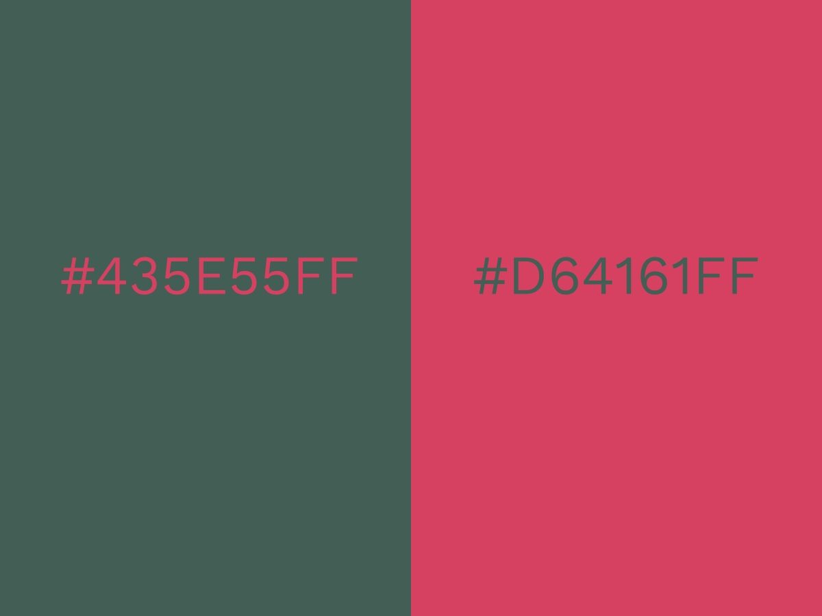
Another pairing that works because of balance is this mysterious deep green combined with a rich rose pink. What works here is the balance between the masculine green and feminine pink, neither of which are too extreme in either direction.
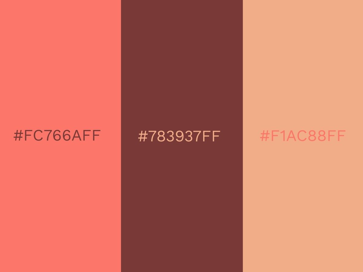
A fabulous trio colour combination would be this coral, soft brown and peach. Together they conjure up feelings of hugge homeliness. Here, the warmth of each colour creates the harmony. This combination would be perfect for a living room or bedroom!
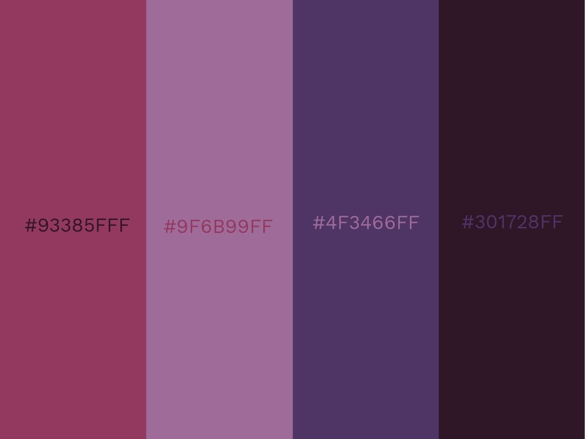
Once you go above three color combinations it is important that you have a clear vision of what the end goal is. Harmony and balance is harder to achieve so make sure you try and test before committing. This purple shaded quadrant is in perfect harmony because it pulls inspiration from different families of hues. The rich raspberry is the perfect accompaniment to the dark inky purple. Both of these rich shades are then set off by the lilac and mid-tone blue/purple. There are also free color mixers to try your color mixes risk-free and share it with other color enthusiasts.
For a full compilation of inspiration, check out 80 Eye-Catching Color Combinations.
Color Palette Examples
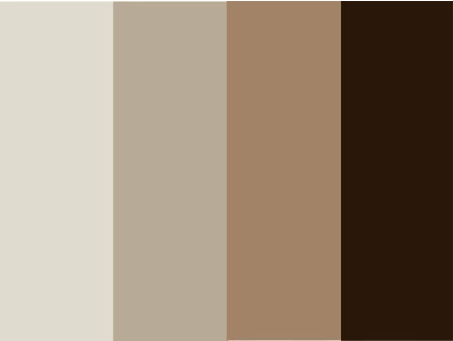
Beige isn't one of the most popular colors for branding, with it often being one of the tertiary colors or even less significant. But where it does fit in as more than a background color, it's a powerful choice.
This cool brown and its broader palette are often used by companies selling furniture or assorted luxury product packages.
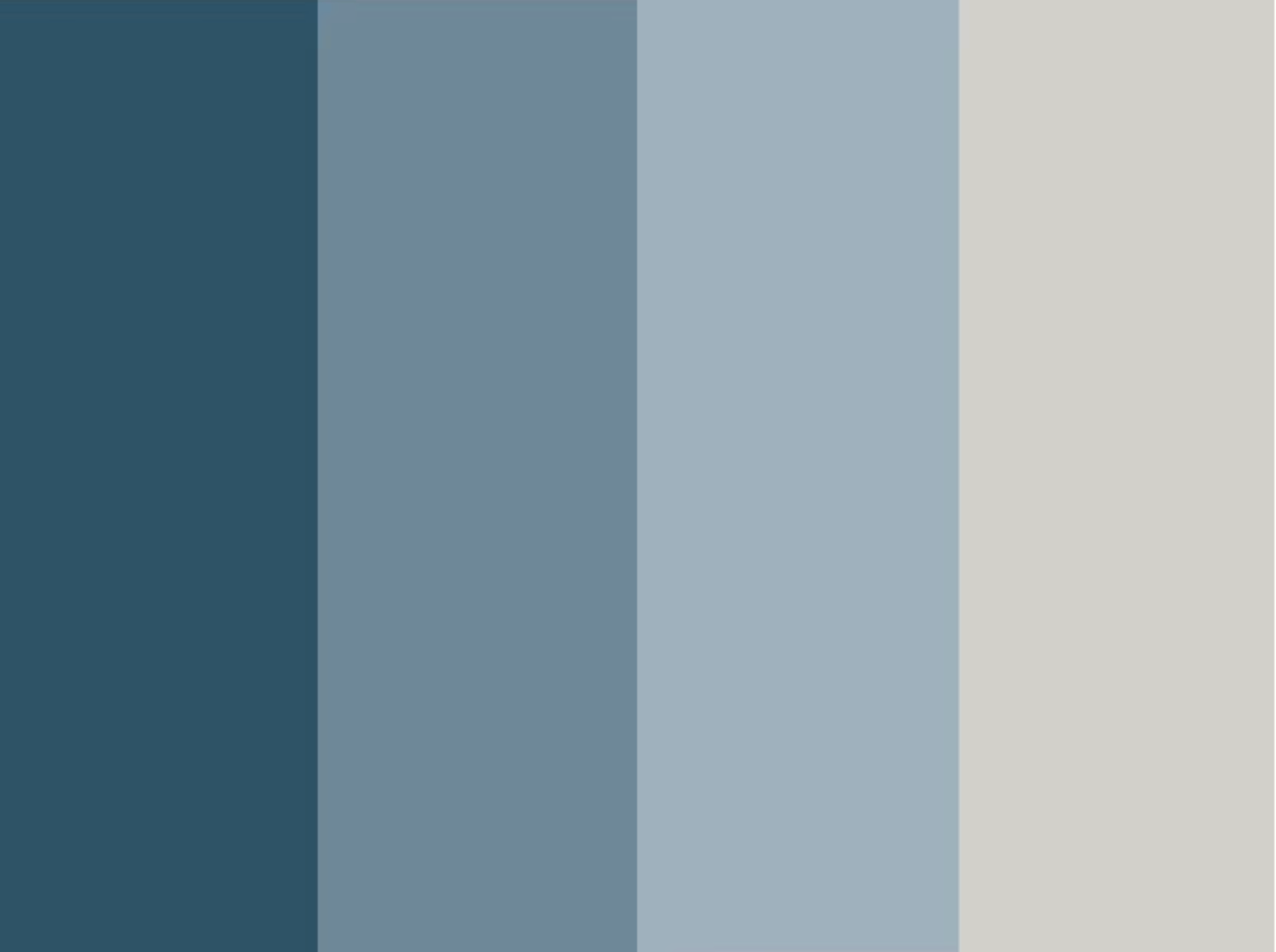
This Design Wizard classic can be easily expanded for more complex color blending. Blue colors, even in darker shades, are cool colors representing emotional coolness and relaxation. Mixes of blue with hot colors are typical for pairings. For palettes, it's more common to edge towards a progressively cooler side.
All kinds of companies can use this color scheme or ones similar to it. Experiment with the color fields to create a different type of harmony.
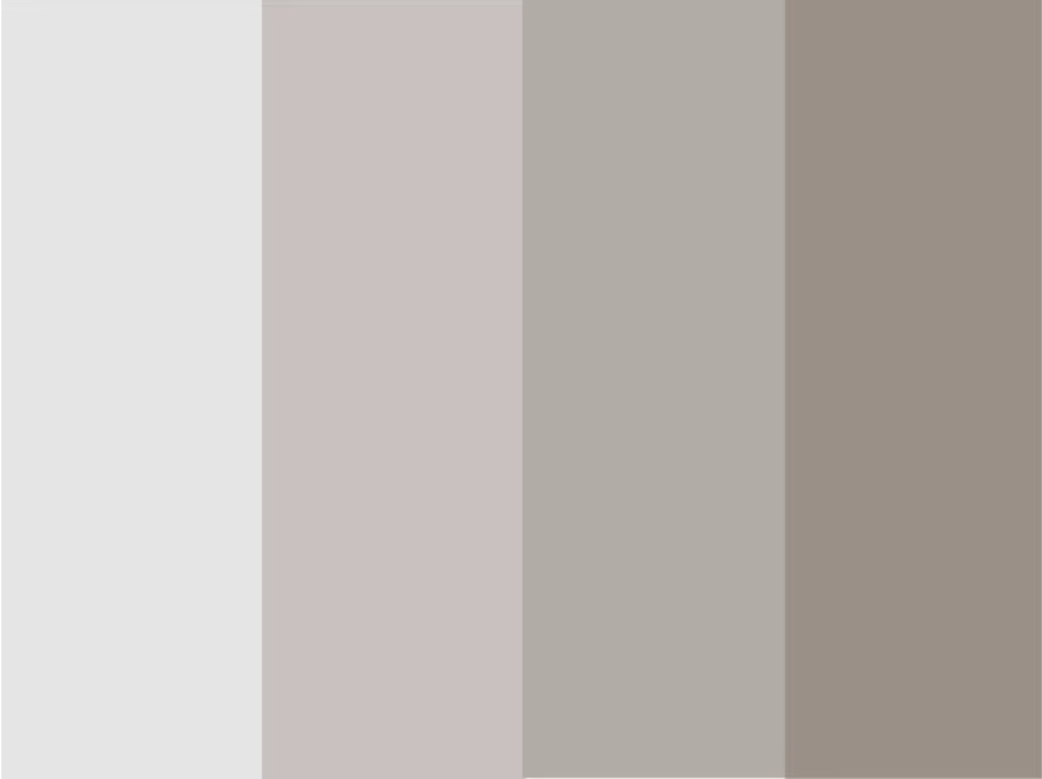
This simple color palette is still color conscious; you don't always need to overwhelm the viewer with a strong or bold color scheme!
Professional or office-themed branding will often employ simple, cool colors like these.
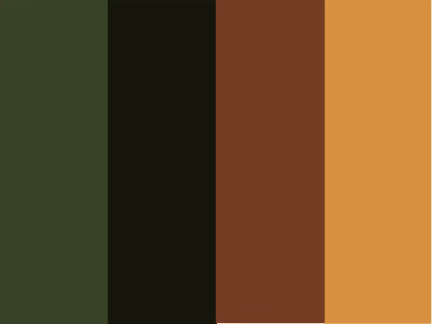
Base colors can include a wide range of primary, secondary, or tertiary colors. While green is less common, it is still used in the branding of many companies and when used properly can help you stand apart.
Green is more often used by companies selling natural or nature-themed products. It's also often used by companies selling financial products or services, particularly in the US where it is associated with money. But there is no reason to strictly restrict this type of color palette to these industries. Depending on the area, real estate businesses can arguably also make good use of it.
Dark green colors and earthy tones can spawn beautiful color schemes that slowly edge toward darker browns and greys. Try using color tools to make similar palettes with different shades of dark green. Fresh green will produce a very different result and will edge towards white.
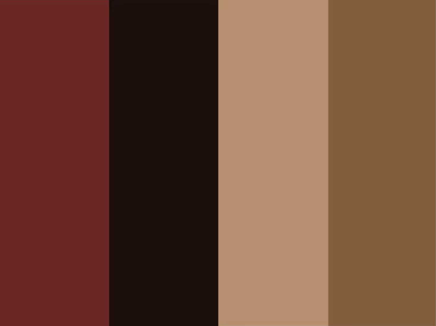
Dark colors, especially dark red and black, provide a luxurious appearance. The color blending will normally edge toward dark colors and cooler, more naturally-appearing shades of brown. The calmness and coolness of the latter colors complement the cool and luxurious appeals of the former.
Dark red and black are almost inseparable. But with different custom color shades, color scheme generators may create different tertiary and other colors. Brown color themes will usually edge toward darker shades.
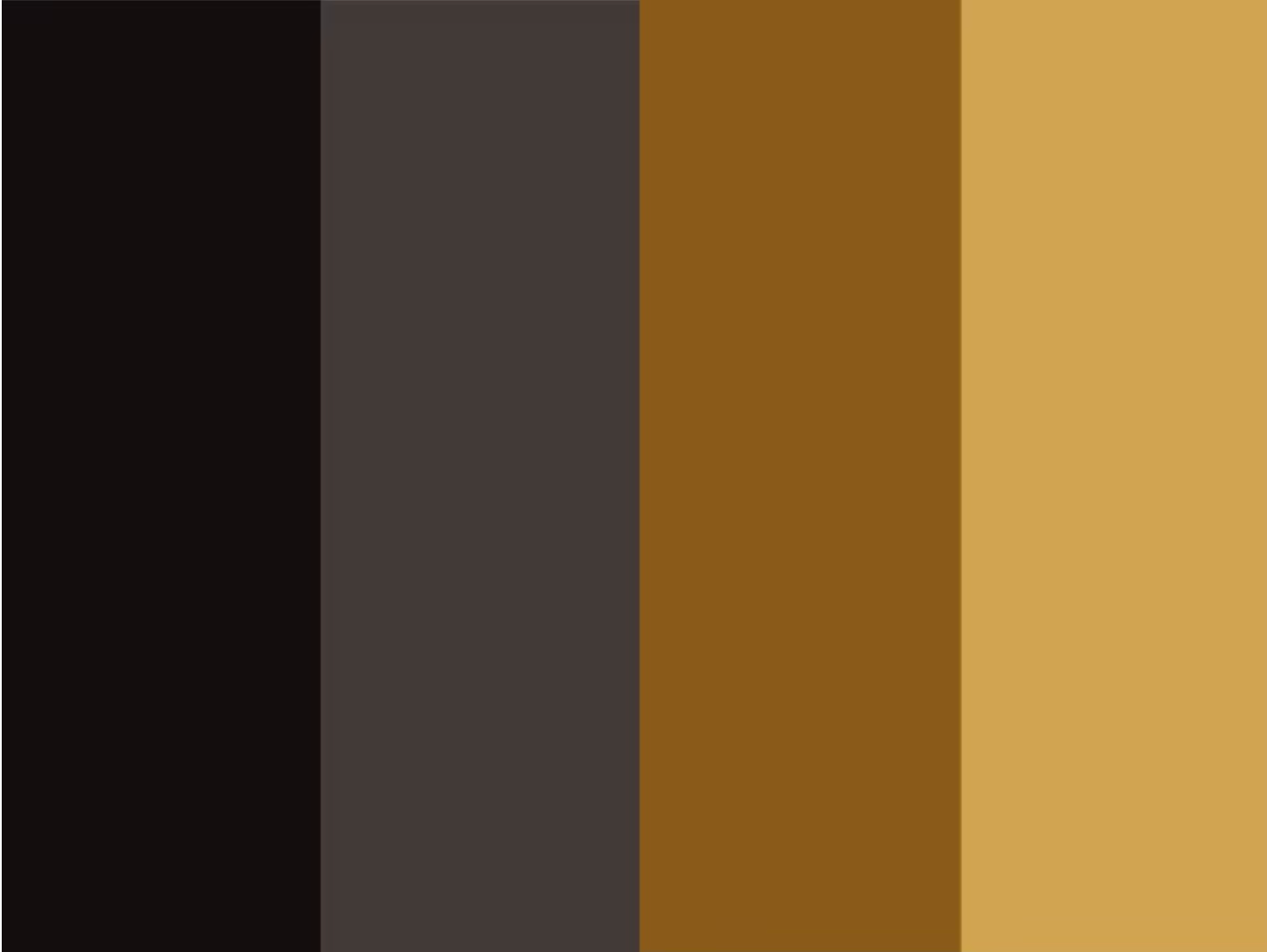
If you want something more luxurious, perhaps for car services, financial services, and others, black is the place to start. The brighter brownish/yellowish colors add to the luxurious appearance, with grey as an appropriate separator in any brand imagery.
The Meaning of Colors
Green
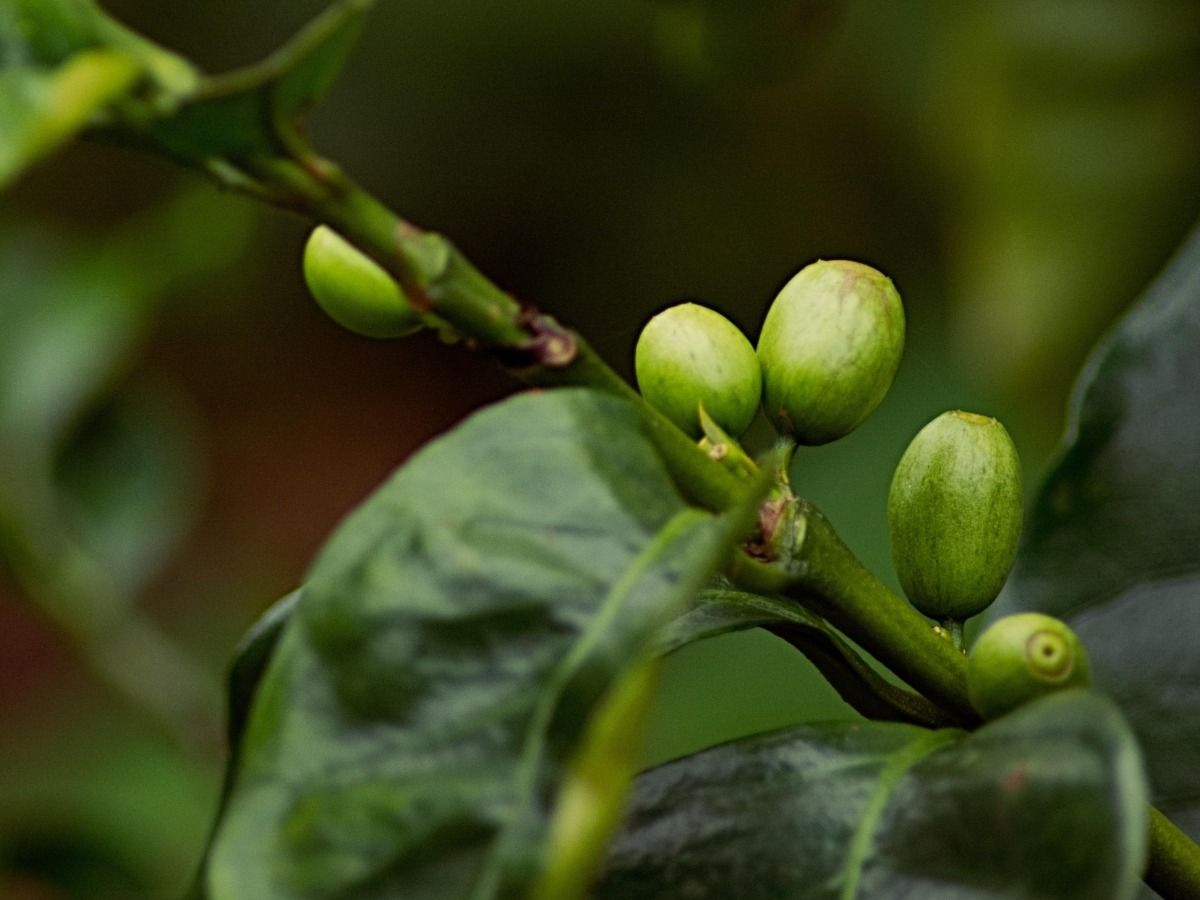
We often associate green with nature, health and vitality so it’s no wonder we see this color in environmentally friendly products or natural beauty and health products. Use nature inspired hues in your designs to convey a natural feel.
Apply Green Color Symbolism for a Natural and Healthy Look
The choice of fonts to go with your composition is as important as the copy to make sure you highlight the feeling of serenity. Pick a light yet lively font style. The use of a handwritten style in our design creates a more personal connection. We also blurred the background to keep the focus on the words.
Create an Unexpected Effect with Light Green and Light Pink
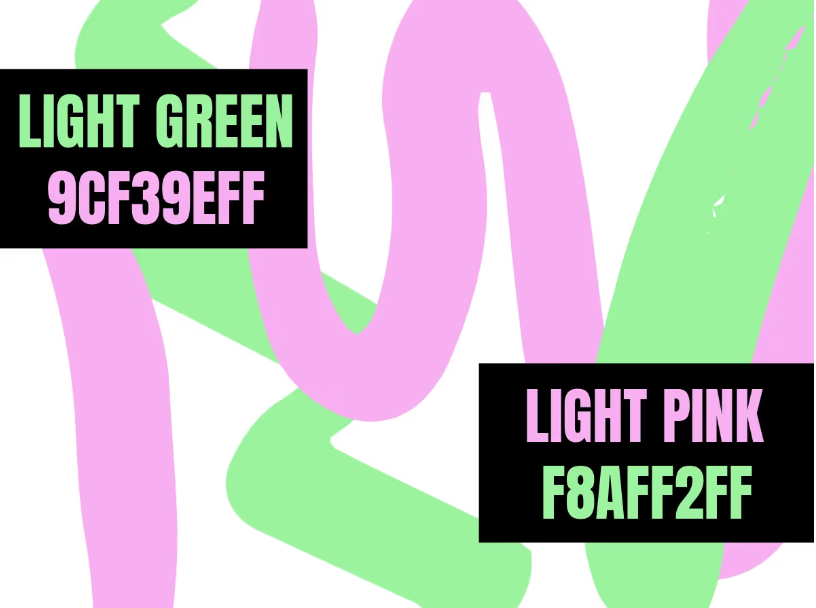
If you want to make it more atmospheric and cozy, just deepen the tones with rich moss green and a dusky rose pink.
Red
Red is one of the basic colors is powerful and can convey many different emotions and feelings depending on its context. It can invoke passion and love in some but anger and rage in another. Universally, red is a color of strength and brands often use it to show power, even dominance. My first thought when it comes to red and branding is Coca Cola, and I’m sure no one would argue against their domination of their market.
Craft Graphics that Stand out with Striking Reds
Red, black, and white are a dynamic trio that is frequently used in advertising to attract attention. The red background initially pulls in customers while the black and white stand out to deliver the message of the sale.
Fuse Warmth and Revitalization with Red and Teal
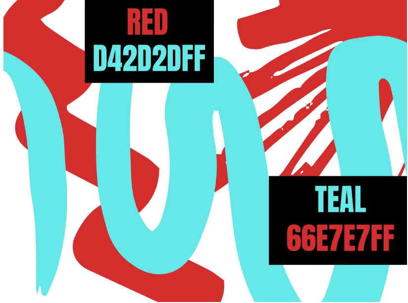
When merged with the fiery and passionate red, your designs pop with energy catching the eye while also emanating relaxation.
Blue
Blue – some see blue as a calming color while others associate it with sadness. It has of course long been a color to denote masculinity, often campaigns associated with men’s health overwhelmingly use blue. A dark navy blue is often used in business campaigns as it conveys a sense of seriousness and professionalism. Use navy blue in your design for that corporate feel and conservative look.
Display Confidence and Stability
In our sample design, we use various shades of blue in the icons, text, and background to heighten feelings of safety and calm. Make sure your text stands out by using a darker shade and choose a more serious and easily legible font.
A Color Combo that Never Looks Out of Place: Royal Blue and White
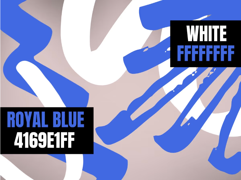
This combination is professional and sophisticated but also creates a relaxed attitude. It doesn’t attract too much attention, which makes it a good combo to use with other colors in your design.
Purple
Purple – a traditionally royal color, purple has been associated for centuries with royalty and majesty. Purple will always be a color of luxury and it is often used to show opulence or expense. To give your designs a luxury feel, incorporate purple throughout.
Claim Exclusivity through the Symbolism Inherent in Purple
Select your focal point carefully and guide the eyes towards it. The visual hierarchy in this design is determined by the purple lights that direct us to look deeper into the background where we find the most important information like the name and date of the event.
Bring out Positivity with Purple and Dark Green
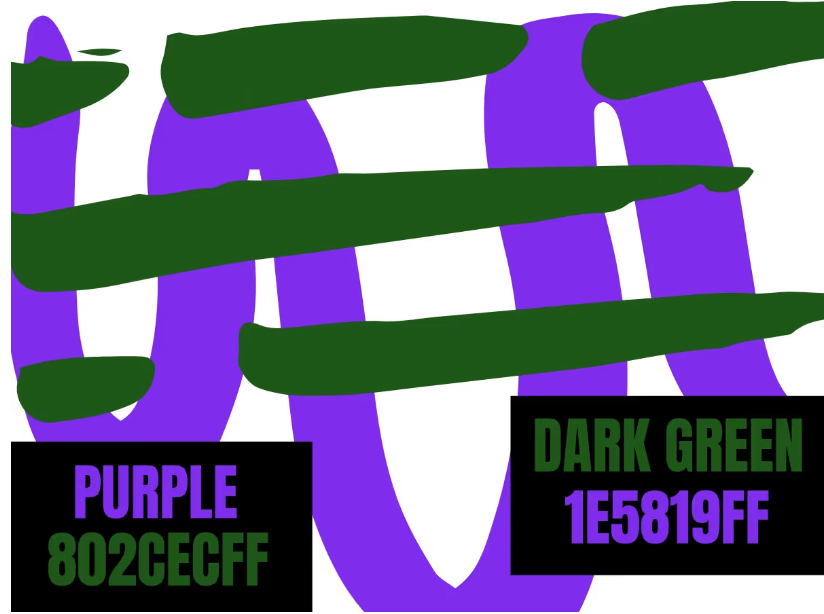
Also reminiscent of purple flowers in a sea of green, this color combination adds vitality and energy to any design.
Orange
Orange- It is said that the happiness associated with the color yellow combined with the energy of red comes orange. Orange gives a sense of sunshine, joy and the tropics. The color is associated with happiness, creativity, warmth, sunshine, fun and happiness. Orange has the appearance of general wellness, vibrancy and emotional wellness. Orange is believed to offer emotional strength in difficult times.
Highlight Creativity and Vibrancy
Apply different shapes in various colors to see what fits and to create your effective tagline and title. Ensure the choice of font you go for matches with the rest of your design and the colors with the hues of orange you decided to use.
Combine Light and Dark with Orange and Black
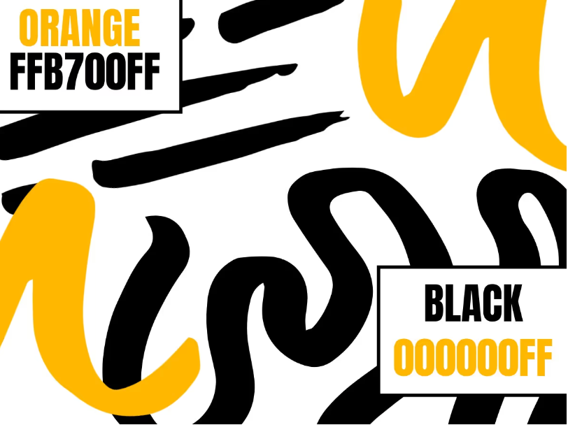
In your designs, the sincere and practical black can be lightened up by the associations with creativity and exuberance of orange.
Yellow
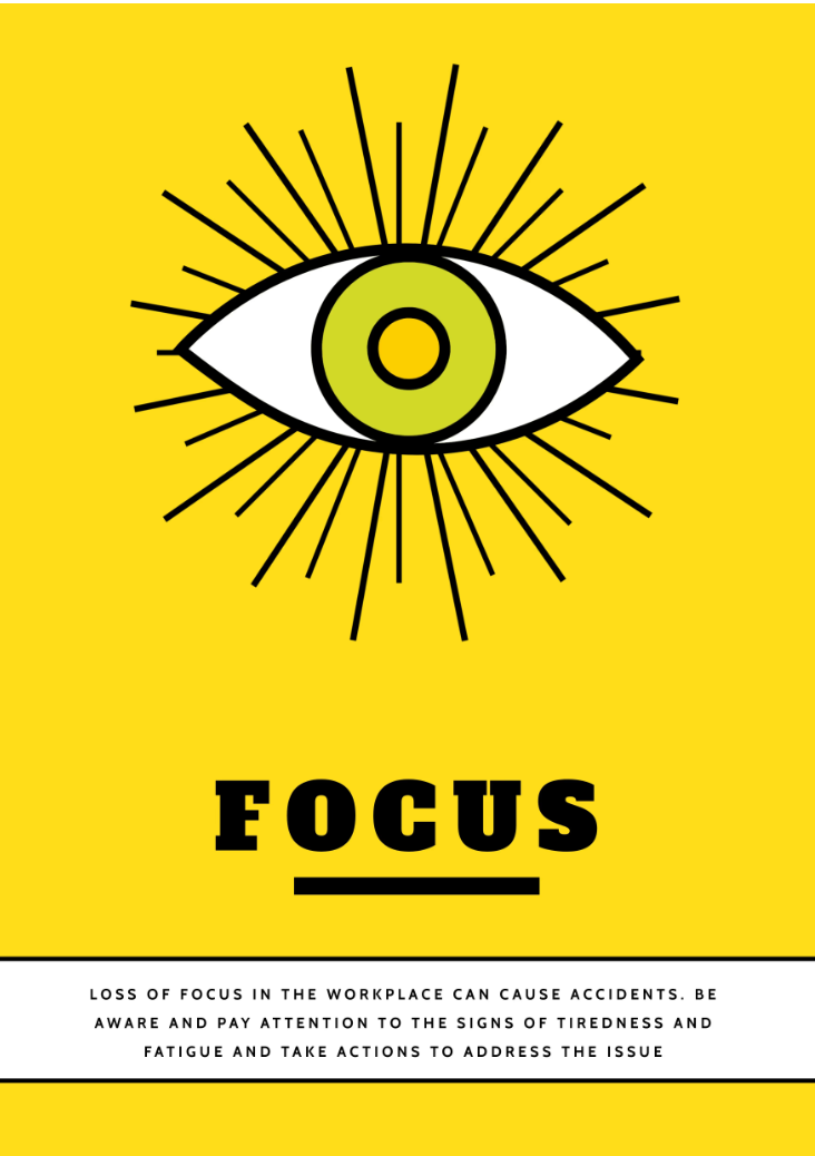
Yellow- Yellow can be seen as two different meanings, one being a bright, fresh, positive energizing color. Sunshine and optimism are more characteristics of yellow along with building confidence and encourages communication. Bright yellow tends to be used a lot in products for children in particular as it’s fun and attention grabbing. On the other hand the overuse of yellow cause cause negatives. A lack of focus, frustration and inability to complete tasks can be the result of the overuse of a bright yellow color.
Make Your Message Clear Using the Right Color Meaning
The message in our design needs to have an impact, so we reel viewers in by mainly using the color yellow. The black text then catches the focus with its powerful contrast to convey important information.
Create an Optic Flow with Mustard and Black
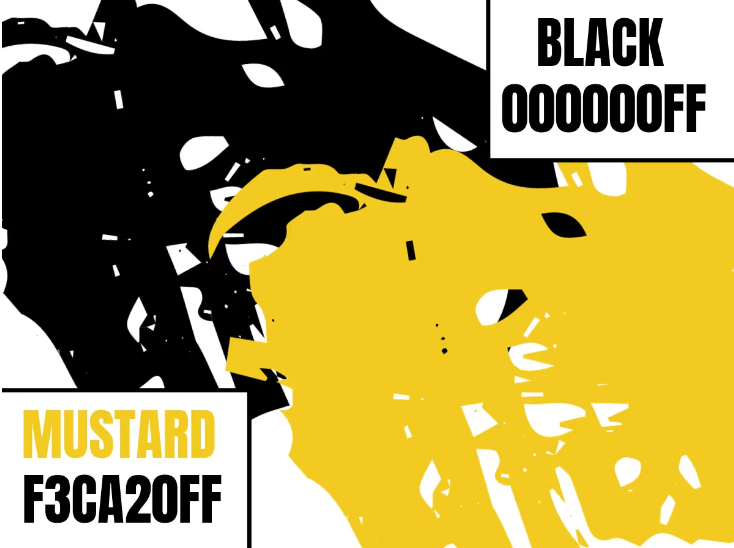
Mustard as a darker shade of yellow is an intriguing and distinctive color but is also used to relax and soothe. The contrast with black creates an optic flow, as the lighter color illuminates the darker one.
Pink
Pink- Pink on the color wheel instantly reminds people of femininity, girliness, gives a sense of calmness, love and kindness. The soft and relaxing, romantic color is actually a light shade of red but so popular is a color of its own and is said to be the sweet side of red. Ever wonder why Iowa Hawkeyes have pink locker rooms for visitors?(Or did you know they do) Well it is famously said to be to make the opposing team be so relaxed at the sight of the color and also another theory of the pink locker rooms was they would psychologically beat the opposing team before they stepped out on the field.
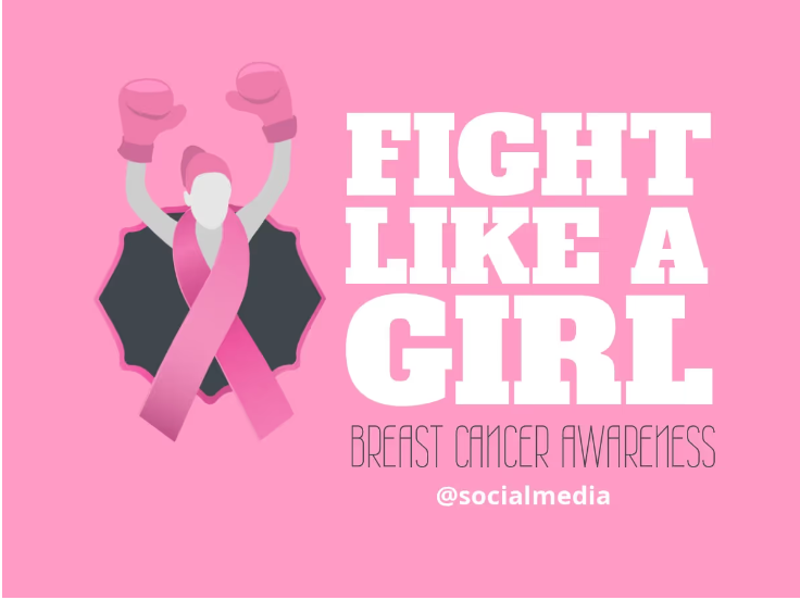
Pink Colors Symbolize Awareness and Grab Attention
Although the white copy is a bold font style, it doesn’t overpower the icon or background. Breast cancer awareness slightly moves in the background but still sticks out in all caps. Experiment with different shades of pink to get the most effective hues for your design.
Use the Cultural Harmony of Hot Pink and Sky Blue
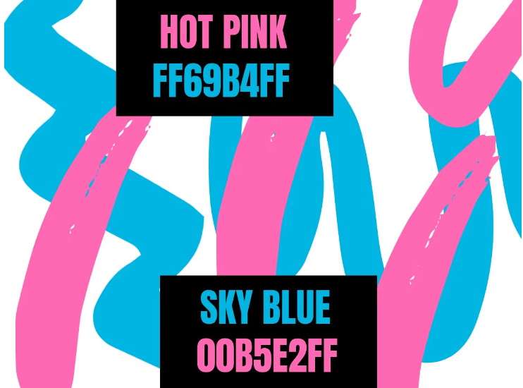
Hot pink is energetic and youthful and works well with sky blue as it tempers the vibrancy of the darker pink shade.
Black
Black- The color black comes with many mixed emotions and meanings for everyone some include power, mystery, aggression, sophistication, evil, aggression, grief, mystery or even both positivity or negativity. The color can also be used powerfully amongst rebellious teens or people wanting to cover up weight or even feelings, fears and insecurities. The color black is commonly used in brands in contrast with white to stand out, you would think since they are opposite colors they would not work well but in actual fact they’re very effective.
Black Symbolizes Effective Luxury
Designers and marketers use it to deliver powerful and clear messages. In our design, black is used to highlight a professional service. If your design is mainly black, make sure you also use lighter colors to make elements or text stand out. We used white to keep this business card simple.
Timeless Color Meaning of Black and White
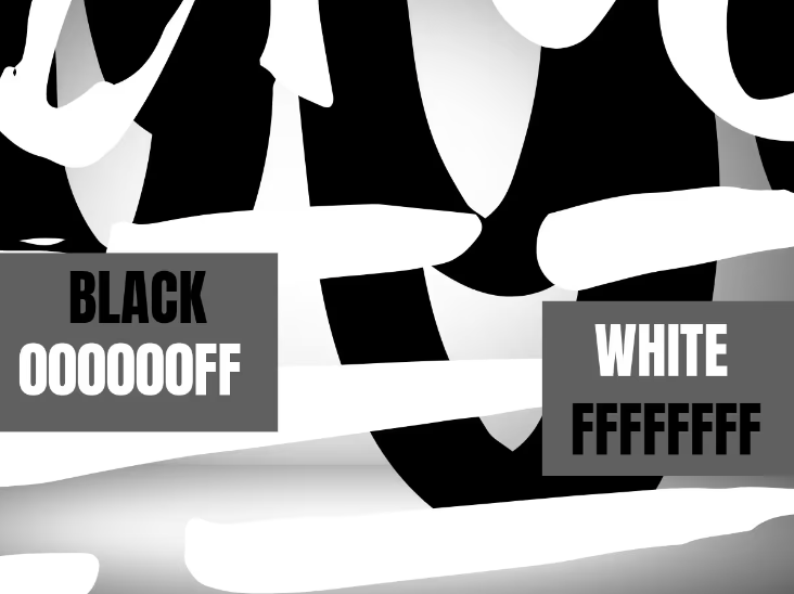
The contrast between the dominant black and the peaceful white makes this combination highly effective. It’s a visual symbiosis as black becomes darker and white is highlighted.
White
White- A color that is associated with purity, innocence, light, safety, brilliance and cleanliness. A blank canvas being pure white is satisfying and clear to look at as painting the walls in your entire house is now a trend as it has a clean and classy look. The color white aids gives mental clarity, feeling and look of freshness and clutter free. Like most colors when overused it can have negatives, with white being blinding if it is in very bright light. White is a very complimentary color as it almost goes with any color on the color wheel.
Keep it Clear and Simple
We used the already established color connections of white, red, and blue with the barber profession for our design. The classic white background also offered a lot of room to experiment with text color and other elements.
Spread the Warmth with Cream and Chocolate Brown
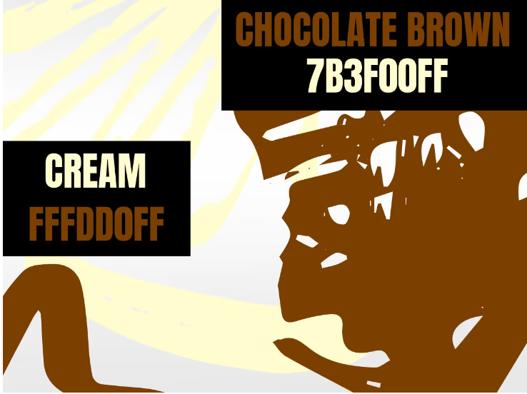
It’s the shade of milk chocolate automatically making it look warm and inviting. In combination with the pale hue of cream, you can add a wonderful warming touch to your designs.
Turquoise
Turquoise- Being a color between blue and green color turquoise can be summed up as cool and calming. The meaning of the color can be described with descriptions such as wisdom, creativity, emotional balance, growth, peace of mind and mental clarity. It is said to have turquoise arouse is good in case of emergency the color can help you think clearly and make decisions.
Brown
Brown- Brown can stimulate the appetite even though it can appear to be dull and serious it can be associated to high quality, comfort and friendly and approachable. Another side to the color brown is that it has a sense of wholesomeness, nature, organic, outdoors and agriculture. The color brown is teamed up with also depends of the meaning it gives off for example brown and ivory can appear stylish and classy.
Gray
Gray-Gray would have more negative characteristics rather than positive. A timeless and practical color is emotionless, moody, dull and dirty on one hand but on the other in the right setting is sophisticated, knowledge and wisdom. The perfect neutral, intermediate grey color can be used as a canvas for designers. The ‘gray’ area is commonly heard of and is the inbetween of black and white and unemotional.
Establish a Base to Build On
Add a splash of a more lively color like the blue in our design to make it pop. The blue gives our business card an extra lift. Experiment with different shades of gray to see what fits best with your brand.
The Pantone Colors of the Year 2021: Ultimate Gray and Illuminating
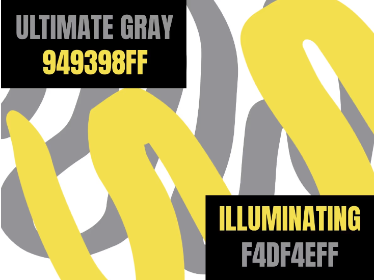
In your designs, you can use the bright accent color of Illuminating to direct the eyes towards your focal point. As a whole, this combo represents positivity and fortitude.
Coral
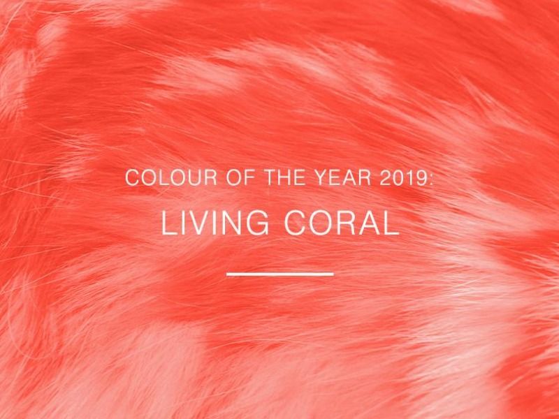
Coral- A color made up of pink and orange giving the vibe of warm and tropical seas and can be a color of peace. Coral give you the boost to form balanced and healthy opinions. Living coral(color of the year) a shade of the coral family is very popular is nourishing and youthful without being overbearing, our color combinations blog goes into more detail about living coral and many more colors.
Indigo
Indigo- Described as a colored with a mix between blue and purple with similar traits. In times of deep concentration the color indigo helps to focus and is a powerful and dignified. It includes structure and power also and can in fact promote wisdom and devotion. This color is strong and on the negative side is associated with addiction and too much of the color is also said to leave your ego go out of control.
Amber
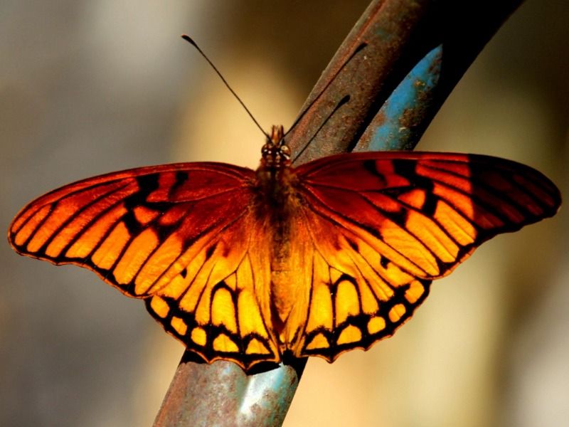
Amber- Similar to coral yet different looking more like a shade of dark yellow. It promotes feelings of joy and energy but can be daring. The color amber can make one feel safe and create an atmosphere full of happiness. In marketing the orange yellow color of amber can draw impulsive shoppers into the store. Some would say someone who loves orange that uses amber as a slightly toned down attention seeking version.
Olive Green
Olive Green- A dark shade of green that shows ambition, greed and flattering. A mix of meanings for this color but also symbolized with luck in most Western cultures. Leadership especially upon women is commonly associated with the color olive green.
Lilac
Lilac- A soft, relaxing, friendly look color that has a sense of innocence. A color that represents a very light purple, sense of tranquility, peace and friendship. More traits of the color lilac are bravery, value and also loyalty. A nice unique color that we don’t see enough of. Brands may choose this color to express the personality of their brand as open-minded and friendly.
Fuchsia
Fuchsia- You would presume fuchsia is a shade of pink, it is actually a purplish red color that is very vibrant and eye catching. A confident, bright and bold energizing color similar to pink mentioned above is perceived a ‘girly’ color. Fuschias inspires commitment and draws lots of attention if it were a person it would be loud and outgoing.
Burgundy
Burgundy- A touch lighter than the color maroon burgundy can be viewed as a color to represent power, richness and a higher society class. A sophisticated yet serious color on the color wheel. Many wine companies would use the burgundy color in branding seeing as burgundy is part of the wine color family.
How to make a color palette on Design Wizard
Next, if you want to automatically produce a color palette, use one of these free tools.
Once you have the color scheme you want to use, save a draft. Save the palette so you can always paste it elsewhere and use it as a reference. To ensure you use these default colors properly, save the hex values (the hashtag with the color code). Our hex values are universal; all major design tools use the same values to create the exact same color.
Creating a vibrant color palette on Design Wizard is a simple process. To help you get started, here are some examples we've provided before, and some additional ones based on social media conversions and professional automated creations.
Color And Branding
Savvy marketers and business owners know the importance of colour on branding. As we showed you above, colours hold their own special meaning and significance and they have the power to evoke emotions.
The colour choice of certain brands is so successful that they have trademarked the exact shade. Tiffany & Co is the famous New York City Jewelers known not only for their amazing choice of jewelry but for their iconic robins egg blue branding. Tiffany Blue was trademarked in 1998 and is also a Pantone colour.
Barbie Pink, Cadbury Purple, T-Mobile Magenta and UPS Brown are all trademarked colours that have worked spectacularly for their brands.
They have found the formula for brilliant brand recognition. It is estimated that brand recognition can be increased by up to 80% by effective use of colour throughout marketing, packaging and logo design.
Creative marketing uses the emotions of consumers to sell their product or service successfully. Using colour as a tool to do so is a quick and inexpensive way to carry the right message. As outlined in the section above, every color carries its own meaning. As a business owner or marketer, use this to your advantage.
If you are a brand new health drink, then chances are you wouldn’t use black as your primary color because the immediate associations that people automatically link would be way off. On saying that there is room for creative licence. Sometimes a bit of shock value works wonders! But, always make sure you understand what you are doing and why.
Brand colours can be used everywhere, from their logo and website to social media and marketing collateral. But they are just the obvious ones, business owners need to think about staff uniforms, store fit-outs and advertisements. Before you commit to a color, make sure that you have thought all these things through thoroughly.
An understanding of color comes naturally to some people but there is always room to improve and push the level of your comprehension. Those for whom it doesn’t come so easily, this blog post should help you to lay the foundations to build on your color knowledge. And if you’re looking for a challenge to start creating awesome color palettes for characters, take a look at color theory in character design.

Briona Gallagher
Briona Gallagher is a Product Manager. With a background in Fine Art, Design and Journalism, she has a demonstrated history in all areas of visual and written communication. Her favourite design tools are Background Remover and Moodboard Maker templates - "They make life easier" - as she likes to say.
